Goodworld: Tools to fuel your cause
Overview
Goodworld launched a philanthropic movement with #donate: fintech allowing for instant hashtag donations on social media. This year the company expanded into cutting-edge Corporate Social Responsibility tool suites that make it dramatically easier for businesses and nonprofits to scale their positive impact. My work for Goodworld included design, user research, and team workshops during this time of expansion. Original branding was created by SouthSouthWest, which I interpreted and extended with new UI and illustrations.
Services
UX/UI
UX copywriting
User research
Service design
Persona mapping
Problem #1
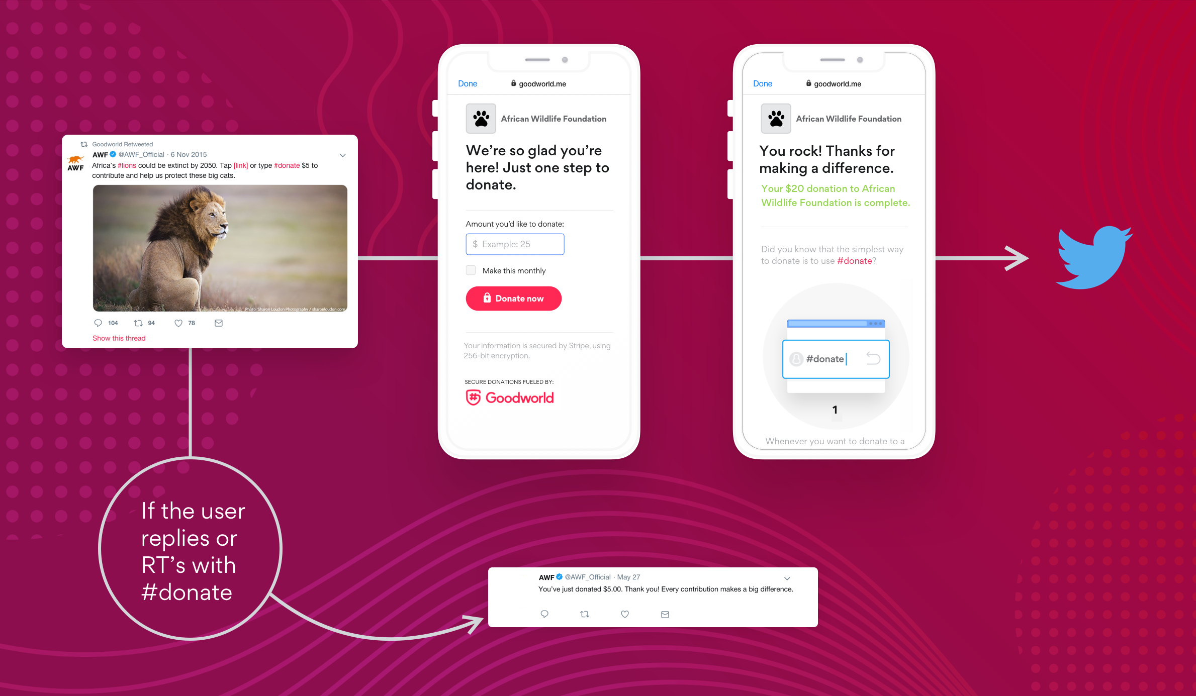
Although the platform was seeing some success, there were product issues that needed improving. On Twitter, people who expressed interest in donating to a cause, rarely followed through - showing low conversion rates compared with other social networks.
Research and solutions
I led the team in conducting usability testing with Twitter users to find out what was going wrong and found ways to significantly reduce the drop-off. It turned out that users weren’t able to understand what it was that they were doing when trying to support a cause. Misleading copy and an opt-in screen shown too soon meant that users weren’t being educated about the service, or learning to trust it.
We allowed users to donate immediately, and afterward showed them an education screen with an opt-in option for instant donations to all their favorite causes - reducing barriers to conversion and building brand trust. These insights helped drive improvements for Facebook flows as well.
Problem #2
The company wasn’t sure how to best create an integrated product that would include all the new technical capabilities and tools on offer - without overwhelming the customer.
Research and solutions
First, I helped the team solidify who were the target personas that would benefit from the new, integrated product. As concept research, we then conducted in-depth interviews with people who represented this target audience, using a selected set of questions to determine their sentiment around the new offering.
Insights from the research allowed the team to better understand the audience’s pain points, and plan a development timeline that focused first on features that potential customers found most valuable.


