Groove: Get into flow
Overview
Groove is an online coworking community helping freelancers and remote workers get into flow more easily - and get more done as a result. Using basic behavioral principles and fostering connections between members, using Groove helps you focus and keep motivated as you work. My work for Groove included app design and user research for launching the product. Original branding was created by Emunah Winer, which I interpreted and extended across the product. Marketing copy was created by Netanya Cimone.
Services
UX/UI
UX copywriting
User research
Landing page design
Email design
Exploratory research
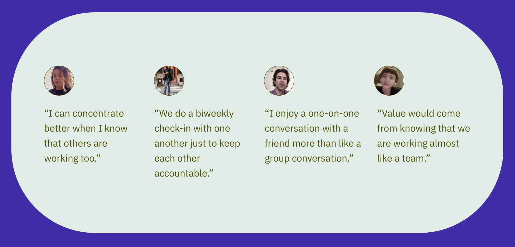
Although the founding team had already conducted some open-ended research with potential users of the platform, it was time to explore more specific hypotheses with regard to social needs of remote workers and the difficulties of working alone. We interviewed 9 people, 7 of which were in the target user base of freelance and remote workers and 2 of which had already been using a prototype.
We learned in detail about the difficulties of working alone and just how participating in a focused time-block of work can help. These interviews helped us convert the original bare-bones prototype into an effective design for a better functioning app.
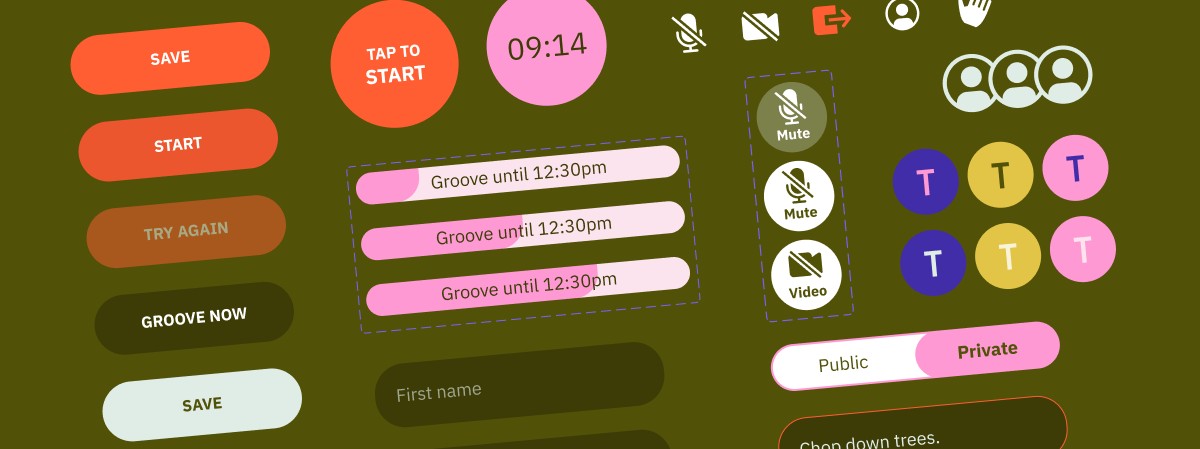
UX and UI for iOS
The groove core experience was designed to allow for members to join or create a focused 50 minute Groove at any time of day. At the beginning of a Groove, you meet your coworkers and define your goals. Then, work happens for a undisturbed block of time where everyone’s goals are ticked as they are accomplished. At the end of the work period, everyone re-groups to share experiences and decompress. I designed the app with a no-fuss perspective that put simplicity first.
Branding for Groove was designed by Emunah Winer to be quirky and warm, appealing to those who choose professional lives that are off the beaten track.
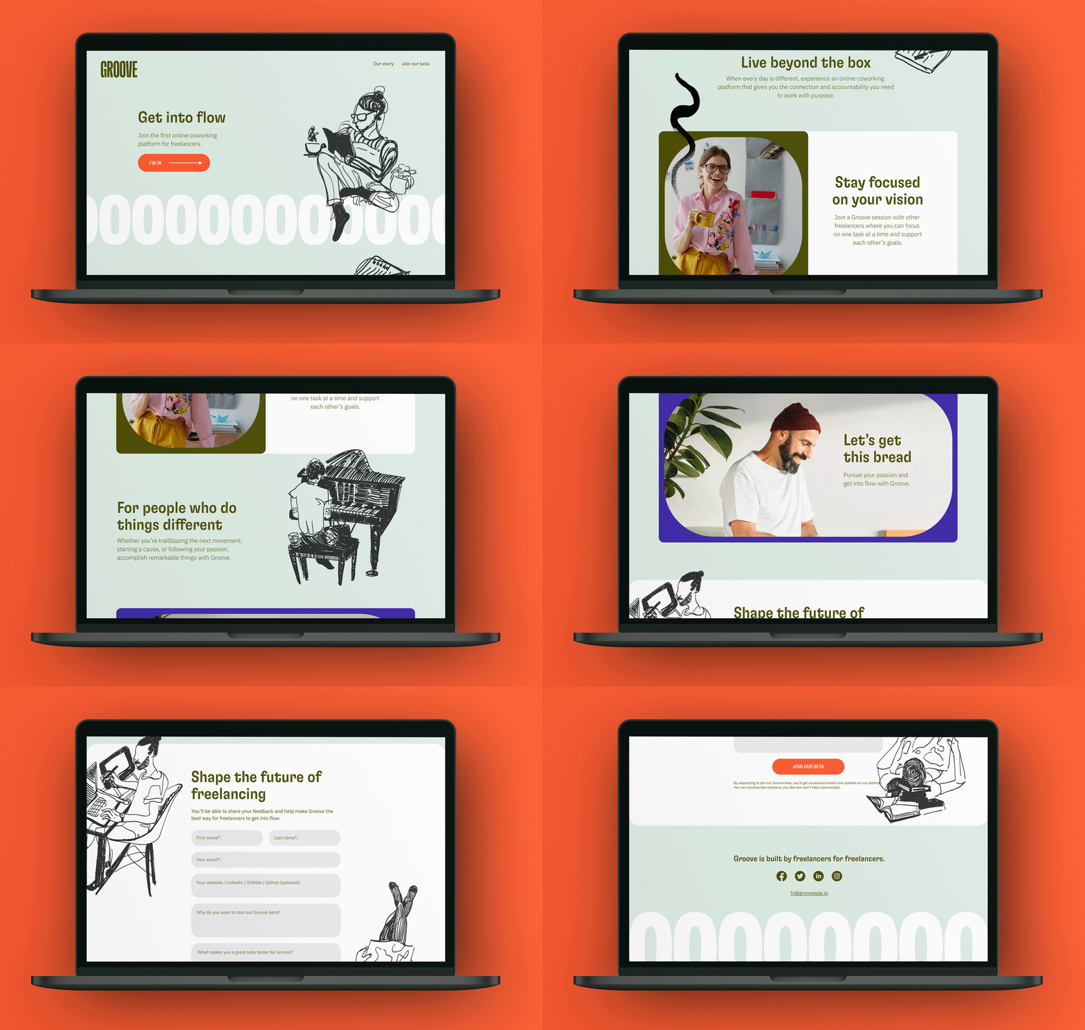
I brought Groove’s weird + wonderful branding and unusual color scheme of dark greens, pink and red into a mobile-first landing page designed for conversion. Illustrations by Netanya Cimone show the spontaneous and creative qualities of the people in the platform - independent thinkers such as artists, marketers, programmers, and more.
Come join Groove’s beta to try it out for yourself.


