Ah, landing pages… Best practices seem to change with each passing month, don’t they? But good, human-centered design isn’t a fad, and properly designed pages are essential to building trust with your target market. Whether you’re new or you’re a veteran marketer looking to improve metrics on your existing pages, here are the key ingredients for designing an effective page. Let’s take a look at the good, the bad, and the ugly:
1. Be focused
A good rule is to include just one clear and consistent value proposition per landing page that you create. Ideally, in the most direct language possible. Boil it down to just the most compelling details that get the particular message across. A good litmus test is to try and explain the concept to your mother, a neighbor, or for the truly adventurous: your child. If the language is direct and clear enough, you will pass the test with flying colors. Here are some good examples:
Real estate financing company Ribbon operates in a fairly clunky market space, where agents watch buyers struggle through the looong administrative and financial process of closing on a home purchase. Their landing page speaks right to the heart of what real estate agents are interested in: closing deals faster. No confusion, no complicated offerings.
Netflix, a company famous for extensively testing copy and content, also goes the minimal, direct route with understated graphics and short, clear text that shows they understand just what you’re here to do - start watching.
2. Show, don’t tell
Probably the most important rule of creating landing pages is not to “hide the goods”. Instead of telling people just how great your product or service is, let them try it out to sample what’s on offer. This is a powerful technique that gets people in the door faster, and greatly increases the chance that they’ll see the value in your offering or get “hooked” on it. This works most effectively when you offer people a chance to try it out immediately, without having to read a lot of text, watch video footage, read tutorials etc etc etc. Here are some great examples of this technique in action:
As experts in the field, the landing-page creation platform Unbounce clearly knows what they are doing (duh). Their page has a big button in the top right that allows curious would-be subscribers to try out Unbounce’s page builder immediately, without even signing up to the service.
Proof, a service that lets you personalize your website’s copy and content depending on who is viewing it, also employs this technique with a “See how it works” button front and center on their landing page. Unfortunately, their button doesn’t lead you to where you can actually try out the service - just to a video preview, which is disappointing.
3. Be actionable
The best landing pages provide a super clear path to take action. Make sure you are clearly communicating whatever simple next steps the reader needs to take, in order to get value from your company. Unclear wording, obtuse calls to action, or shady promises don’t belong anywhere near your page, as they will lead to fewer conversions. It’s also worth remembering that if your brand uses humor as a way to engage, the calls to action will still need to be crystal clear, and possibly not as humorous as the rest of your copy.
Canva, the online design tool, gets it right with crystal clear copy that tells the reader exactly what to expect, and what to do next (“Try free for 30 days” on the button).
Medium’s landing page gives the viewer a different but equally compelling way to take action, by letting them choose topics that interest them, before signing up. This primes the viewer with anticipation of all the fun, fascinating things they will get to read once they sign up.
4. Be legible
While there are brands or situations that call for a lot of evocative imagery, beautiful effects, and colorful animations, sometimes minimalism works better because it brings your point directly to the forefront. Legibility is often associated with accessibility in design, where designers create work that even people with disabilities such as vision impairments can read easily. But even for the rest of us, legibility and typographic hierarchies go a long way toward making a site comfortable to read through. After all, the most important thing is that people will quickly “get” what you are trying to tell them - and they can’t do that when they’re straining their eyes to read.
Intercom’s landing page is an example of the use of good typography with a high-contrast black and white color scheme to communicate a message in a dramatically no-nonsense way.
5. Build trust with branding
Depending on where the traffic is coming from, viewers of your landing page may have little to no familiarity with the company or the offering being described. Testimonials or reviews have long been used to build trust on landing pages, but some viewers are wary of them now that it’s become common to fake them - an unfortunate trend that really isn’t fooling anyone. Branding or messaging that resonates with viewers, on the other hand, is an old but surefire way to show that you care about, respect, and understand your potential customers - and that you intend to treat them well.
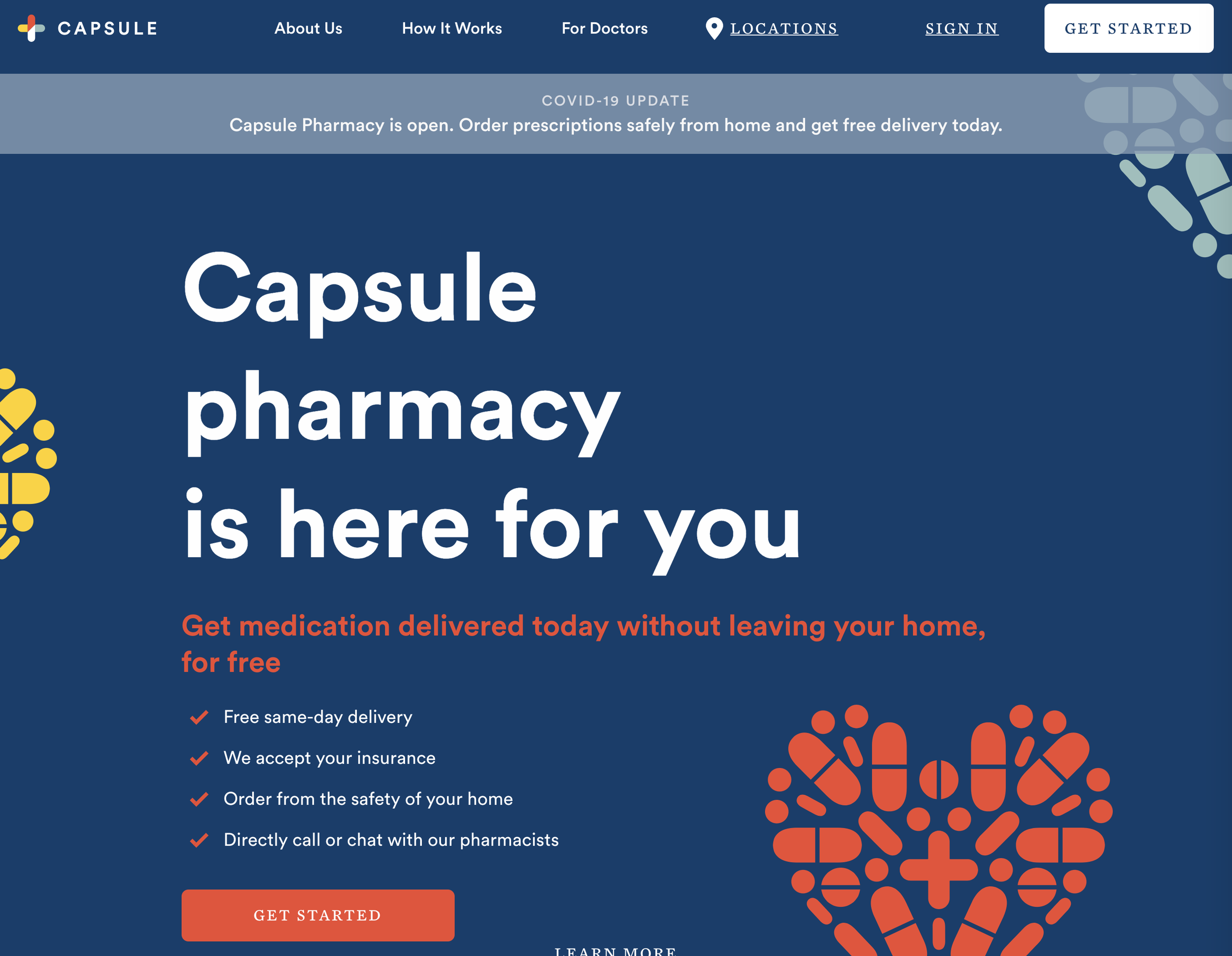
New York based online pharmacy Capsule does this with timely, reassuring copy and friendly graphics, reminding people during Covid 19 lockdown that they deliver medication for free.
6. Cut to the chase faster
Sometimes, otherwise well-executed landing pages just seem too drawn out, stuffed with extra information or images before you get to the real deal. They employ the techniques described above, but just do it too slowly for the viewer, with too much scrolling necessary.
As an example, Slack’s landing page has lots of informative videos and text, but leaves you to scroll aaaalllll the way down before you see this option to actually try out the product. Slack is a company known for short, witty, and generally on-point copy in general so it’s surprising to see so much of this landing page over-worded. One can only assume that it’s still in testing, or that perhaps the company finds it better for consumers to only try out the product after being super informed and motivated. (This is a technique to be used with caution!)
The landing page for Notion, a company providing collaborative online workspaces, also does a lot of things right, but only gives you the chance to try out the product right at the end of a very very long and densely packed page. Once again, we may assume that testing has been done here, and perhaps viewers prefer to be very informed before deciding to try out the product, but reading through it all does feel cumbersome.
7. Don’t ramble
In contrast to the previous examples, text-editing plugin Grammarly’s landing page is short and brings all the necessary information right up above the fold. There is a concise description of what it does, a gif demonstrating how it works, and a button to install the plugin. Nothing else is really needed, though you can scroll down for more information if you want to.
8. Don’t clutter it up
You may want to shield your eyes from these examples - as a designer I certainly do. Why would you want to make customers slog through so much stuff?
Such nicely designed mattresses, but such a cluttered page at Casper’s e-commerce site. I get it, e-commerce sites have a lot to offer, and lots of offers or sales going on at once. STILL. This could have been cleaner.
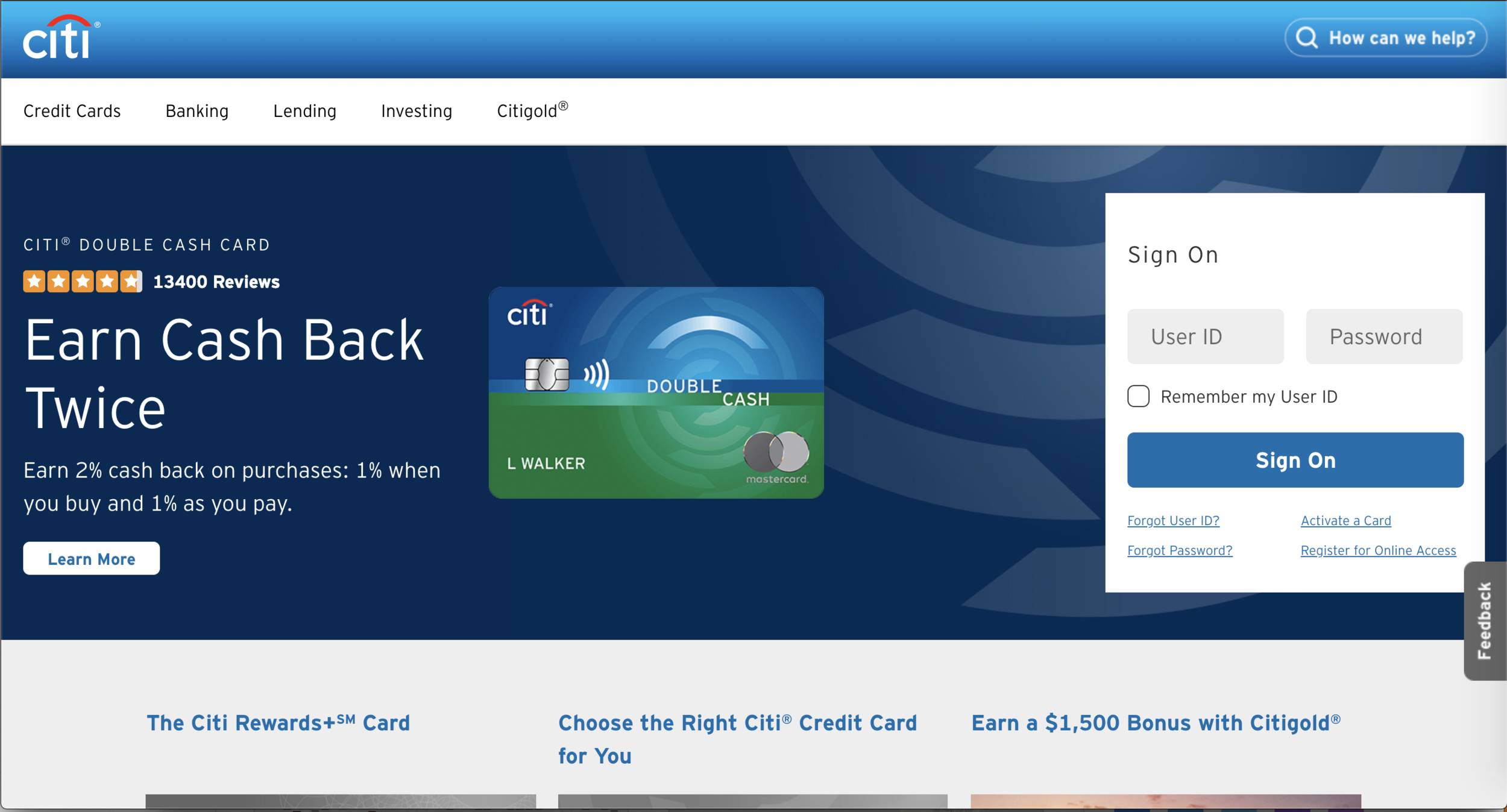
Citibank, what is this? Way too much going on, and the information that is presented, isn’t even clear.
9. A/B test everything
Everything on a landing page is fair game to test. With a well structured test, you can test out the performance of:
Brand messaging
Marketing copy
Calls to action or button text
Photography or images
Entire value propositions
Ideally, structure each test so that only one of these variables is being compared during each test that is run. This way it will be clear why one has performed better than the other. Lots of tools, such as Instapage, exist for maintaining many landing page versions that you can then test repeatedly against one another.
10. Stay curious!
Play around in your testing. Very often, the results will surprise you when you put something new and adventurous out there. It pays to also remember that what worked last year, may not work as well anymore today. Audiences for certain offerings can be very sensitive to changes in circumstances, trends, culture, economic situations and other unknown variables. If you’re keeping a finger on the pulse of what works right now, you’re going to stay ahead of the curve. So for best results, always be experimenting.


