I’m a type snob. I’ll admit it. I’m that friend you have, who’ll delay everybody at the cafe because she’s looking at some new letterpressed packaging near the checkout. Or, I’ll decide not to buy that pasta sauce - because who in their right mind uses Arial on food labels??? That new app? I can tell from a mile away it’s Helvetica. Typography - the art of arranging or creating letterforms - is the geekiest side of design, guaranteed to cause most people’s eyes to glaze over in casual conversation. So why is this bizarre set of skills (and cultivated tastes) something to be proud of?
By this time today, you’ve probably read over 30,000 words (or more) without a second thought as to the enormity of that number. Think about it: If you’d lived 100 years ago, chances are you’d be spending this much time looking at words only if your family was super wealthy or you lived in a monastery.
Today, without even realizing it, billions more people than ever before, experience the world through typography. It isn’t just the increase in literacy worldwide. The most widely used technologies today are mainly consumed through reading - google searches, all that time you spend on Facebook or chat apps... even an image-based interface like Instagram’s uses more text than we realize. We’ve simply become extremely skilled skimmers.
Typography is the art of the subliminal. Image source unknown.
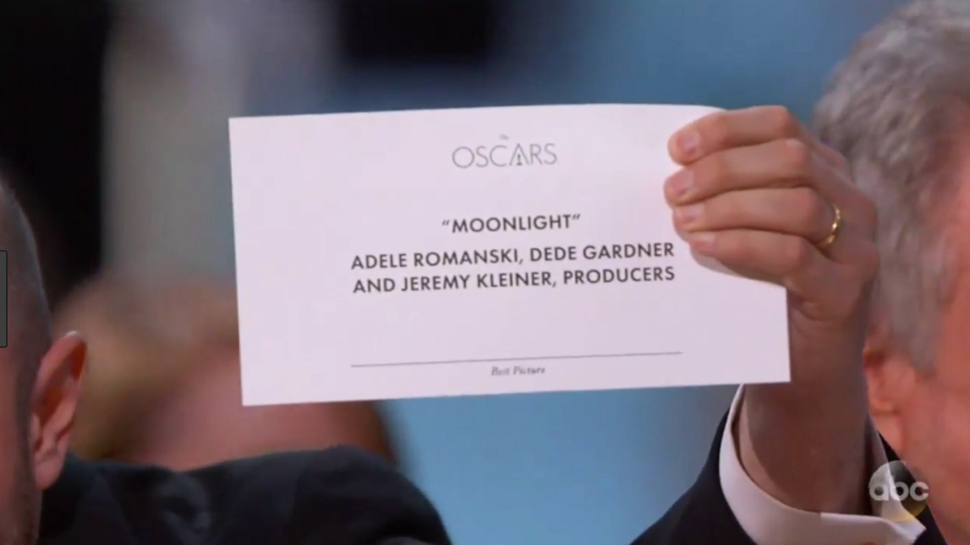
Typography affects us in ways we may not even realize, and type choices (don’t laugh…) can sometimes have serious consequences. Notorious examples of typography failures include the 2017 Oscars mistake, where ineffective typography caused Warren Beatty and Faye Dunaway to announce the wrong film for the Best Picture award. The teeny tiny type with which the name of the award was written, caused them to overlook the fact that they had in fact received the card for Best Actress, rather than the award that they were supposed to announce.
Which award is this again? Image: ABC News
Swanky society events aside, there have been at least two incidents in which elections have been swayed by poor typographic design on ballots - leading voters to misunderstand which candidates they had actually voted for. Both of them were in Florida, and one was a presidential election. All I have to say is, well….Florida.
Wait, who did I vote for? Election ballots for Gore vs Bush in 2000. Image: ABC News
The right typography, however, can create high-quality experiences. Both Amazon and Facebook have been known to test the effects of typographic design on the length of time you’ll pleasurably spend reading lots of text. These kinds of changes can be extremely profitable. On Kindle, that translates into more books read, and on Facebook - an increase in the time you spend on their platform seeing ads interacting with friends.
Typography in digital applications helps with a multitude of challenges. Creating accessibility, communicating emotion, building confidence or trust, and helping users make decisions are only a few of the ways that good typography contributes to success. My own approach to design puts typography at the center of the creative process, since it is the primary medium by which people digest information visually. So naturally, whenever I’m beginning a new project, one of my first steps is to strategize the typography required. I’ll usually review hundreds of font families in order to match or customize one to the use case at hand.
My favorite thing about typography, though, is its unexpected power to really make you feel something. Some of the most powerful digital experiences are made when designers, copywriters, and marketers understand the mindset of their customers, and use design to speak to their emotions effectively. Mailchimp, a company particularly skilled at this, is known for combining reassuringly straightforward typography and copy with witty illustrations of their mascot, a monkey, to guide users through tricky situations.
All the feels: Mailchimp’s now-famous success message. Image: Mailchimp, 3CC London
Perhaps the biggest testament to typography’s ability to evoke emotional response is orange juice maker Tropicana’s 2009 epic logotype and packaging redesign flop. In an effort to modernize the brand, an extensive design overhaul and advertising campaign revealed a new, more geometric, sans-serif logo and a simplified graphic identity for all the juices’ packaging. The project was released to much fanfare and critical acclaim, but consumers voted with their wallets. Within two months, sales had dropped 20%, resulting in a $30M revenue loss, climbing to $50M overall when the company had to revert back to the old look. The new, more abstract, design felt cold and unfamiliar compared to the older, more traditional one. In a grocery shopping environment, where consumers are bombarded with loud new products all the time, the familiar comfort of the old design was what consumers trusted.
A $50M mistake: Tropicana. Image: The Branding Journal
So the next time you’re on line at the coffee shop, or checking out a new website, take a moment to appreciate the typography that’s at work to make your day a little easier or more pleasant. And if by now you’re ready to move on to next-level typeface geekiness by learning about type designers, the AIGA is always a good place to start. I’ll be over here enjoying the letterforms on the lunch menu…
The typefaces I used in the top illustration for this article were, from left to right: Adobe Caslon, Helvetica, and Khula. Tap the links to learn more about each designer and these unique letterforms.


